Building a key-safe Widget highlighter with Circular Reveal Animation in Flutter
Circular reveal animation has always fascinated me; over this weekend, I decided to try it.

Circular reveal animation has always fascinated me; over this weekend, I decided to try it.
TLDR: Code
Free link for readers
Contents
- Building a robust Global Key management system.
- Showing an overlay when we long-press.
- Adding a bounce animation.
- Adding a circular reveal animation.
- Now that we have the animation, why not add it to the page transition?
- Can we modify our circular animation to adjust for other design elements?
Building a robust Global Key management system
Before going to the real building, we must understand why a key management system is required.
You can understand about keys here if you need a primer as to what keys are:
But basically, a Global Key is used to identify and locate a widget in the widget tree. With the help of that key, we can then access its state or data members too. But since it is a Global Key, it has to be unique in the tree. No two widgets can hold the same key, for obvious reasons. And you will understand why if that is unclear in just a jiffy.
And because they have to be unique, and the framework will throw an error if it discovers two keys, playing with Global Keys can be dangerous. You might encounter errors like:
══╡ EXCEPTION CAUGHT BY WIDGETS LIBRARY ╞═══════════════════════════════════════════════════════════
The following assertion was thrown while finalizing the widget tree:
Duplicate GlobalKey detected in widget tree.
The following GlobalKey was specified multiple times in the widget tree. This will lead to parts of
the widget tree being truncated unexpectedly, because the second time a key is seen, the previous
instance is moved to the new location. The key was:
- [LabeledGlobalKey<FormFieldState<String>>#3c76d]
This was determined by noticing that after the widget with the above global key was moved out of its
previous parent, that previous parent never updated during this frame, meaning that it either did
not update at all or updated before the widget was moved, in either case implying that it still
thinks that it should have a child with that global key.
The specific parent that did not update after having one or more children forcibly removed due to
GlobalKey reparenting is:
- Column(direction: vertical, mainAxisAlignment: start, crossAxisAlignment: center, renderObject:
RenderFlex#7595c relayoutBoundary=up1 NEEDS-PAINT)
A GlobalKey can only be specified on one widget at a time in the widget tree.
So let’s create a singleton that retrieves and stores a reference to the Global Keys being used in the app, and will be garbage collected once we don’t need them.
import 'package:flutter/widgets.dart';

/// String literals for different keys being used in the app
const String textKey = 'counter_text';
const String fabKey = 'counter_fab';
const String headerKey = 'counter_header';

const String revealHeaderKey = 'reveal_header';
const String revealFirstLoaderKey = 'reveal_first_loader';
const String revealSecondLoaderKey = 'reveal_second_loader';


class GlobalKeyRegistry {
  GlobalKeyRegistry._();
  static final GlobalKeyRegistry _instance = GlobalKeyRegistry._();
  static GlobalKeyRegistry get instance => _instance;

  final _keys = <String, WeakReference<GlobalKey>>{};

  GlobalKey getKey(String key) {
    final weakKey = _keys[key];
    if (weakKey == null) {
      // if the key does not exist, create a new GlobalKey
      final newKey = GlobalKey();
      _keys[key] = WeakReference(newKey);
      return newKey;
    }

    // if the key exists, check if it is still valid
    final existingKey = weakKey.target;
    if (existingKey != null) {
      return existingKey;
    }

    // if the key is no longer valid, create a new GlobalKey
    final newKey = GlobalKey();
    _keys[key] = WeakReference(newKey);
    return newKey;
  }

  void cleanUp() {
    // Clean up the keys that are no longer valid
    _keys.removeWhere((key, weakKey) => weakKey.target == null);
  }
}- We have a map that stores the Global Keys in a WeakReference Object that will nullify its target as soon as the key is unused and will be marked for garbage collection.
- The
getKeyfunction that fetches the key from the Registry or creates a new one if not present. - And at the top, we have defined some keys that we will be using in our application.
If you need a primer on Garbage Collection, here is the link for the same.

Showing an overlay when we long-press
This is what the official documentation says:
A stack of entries that can be managed independently.
Overlays let independent child widgets “float” visual elements on top of other widgets by inserting them into the overlay’s stack. The overlay lets each of these widgets manage their participation in the overlay using OverlayEntry objects.
- Flutter Documentation
So it’s just like a stack but more sophisticated and is used for Navigation too.
So what we want to do is when we long-press, we want to show an overlay. And on that overlay, we show the highlighted widget in that same position.
Whichever widget we want to highlight, we will need to add a Global Key to it and a GuestureDetector to show an overlay on long-press. So, to make it more convenient and clean, I made a new widget that does the same and takes in a unique ID.
import 'package:flutter/material.dart';
import 'package:widget_highlighter/core/global_key_registry.dart';
import 'package:widget_highlighter/core/overlay_manager.dart';
import 'package:widget_highlighter/core/reveal_animation.dart';

class Highlighter extends StatelessWidget {
  const Highlighter({required this.id, required this.child, super.key});
  // a unique id
  final String id;
  // child to highlight
  final Widget child;

  @override
  Widget build(BuildContext context) {
    return Container(
      key: GlobalKeyRegistry.instance.getKey(id),
      child: child,
    );
  }
}
class HighlighterController extends StatelessWidget {
const HighlighterController({
required this.id,
required this.child,
super.key,
});
final String id;
final Widget child;
@override
Widget build(BuildContext context) {
return GestureDetector(
onLongPressStart: (details) {
// Show overlay on long press
showHighlighterOverlay(id);
},
child: Highlighter(
id: id,
child: child,
),
);
}
}These are 2 accessibility widgets, if you will, that allow a much cleaner setup.
So now let’s build the showHighlightedOverlay(id) function that shows the overlay.
void showHighlighterOverlay(String id) {
  // 1
  final key = GlobalKeyRegistry.instance.getKey(id);
  final context = key.currentContext;
  if (context == null) return;
  // 2
  final widget = context.widget;
  if (widget is! Container) return;
  final child = widget.child;
  if (child == null) return;
   // 3
  final renderBox = context.findRenderObject() as RenderBox?;
  if (renderBox == null) return;
  final offset = renderBox.localToGlobal(Offset.zero);
  final size = renderBox.size;

  // 4
  OverlayManager.showSelectionOverlay(
    context,
    Rect.fromLTWH(offset.dx, offset.dy, size.width, size.height),
    child,
  );
}
Let’s understand what is going on here:
Step 1: Get the widget’s BuildContext from its GlobalKey
- We retrieve the GlobalKey associated with the given id.
- Then, get the BuildContext from that key. This tells us where the widget is in the widget tree.
- If the context is null, the widget is not currently mounted, so we exit.
Step 2: Try to access the widget’s child
- This assumes the widget tied to the key is a Container.
- It then tries to grab its child so that it can later reuse this for the overlay.
- If it’s not a Container or has no child, it bails.
This piece of code assumes the widget is a Container, as we want to highlight the widget without the key. If we highlight the widget with the key, the framework will throw a duplicate key red screen of death. This is why we have a separate widget, Highlighter that adds the key to the Container and adds the child as the child to the Container.Step 3: Get the widget’s position and size on screen
- Here’s the magic: it gets the RenderBox, which has layout info.
- Converts the widget’s top-left (Offset.zero) to global coordinates (absolute screen position).
- Grabs the widget’s size.
This size is used for laying out the child in the same position as it was behind the overlay.
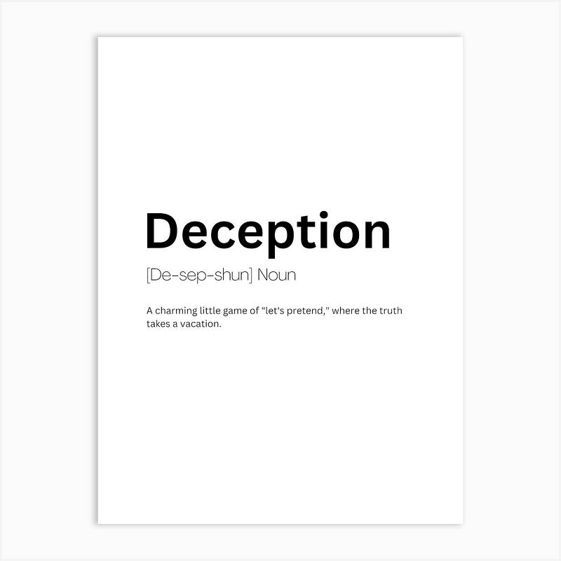
You see we are just tricking the user. All is a deception
Wait, we still have to show the overlay. Here is how to do it:
class OverlayManager {
  static void showSelectionOverlay(
    BuildContext context,
    Rect rect,
    Widget child,) {
    // show the overlay with a dimmed background
    // and that removes the overlay when tapped
    OverlayEntry? overlayEntry;

    overlayEntry = OverlayEntry(
      builder: (context) => GestureDetector(
        onTap: () => overlayEntry?.remove(),
        child: Stack(
          children: [
            // dimmed background
            Container(
              color: Colors.black.withOpacity(0.8),
            ),
            // child
            Positioned(
              left: rect.left,
              top: rect.top,
              width: rect.width,
              height: rect.height,
              child: Material(
                color: Colors.transparent,
                child: AbsorbPointer(child: child),
              ),
            ),
          ],
        ),
      ),
    );

    // insert the overlay entry into the overlay
    Overlay.of(context).insert(overlayEntry);
  }
}
Let’s break this up.
This function displays an overlay on top of the current screen. The overlay consists of a dimmed background and a highlighted version of a specific widget, placed exactly where it appears in the UI.
It takes three arguments:
- The BuildContext where the overlay should appear.
- A Rect that defines the position and size of the widget to highlight.
- The Widget that should be shown in the highlighted area.
Here’s how it works:
- It creates an OverlayEntry. An overlay entry is a widget that floats above all others in the widget tree and can be inserted into the app’s overlay stack.
- The overlay contains a GestureDetector. This listens for taps anywhere on the overlay. If the user taps the screen, the overlay entry is removed — this effectively dismisses the overlay when the user interacts with it.
- Inside the gesture detector, it uses a Stack to layer two elements:
- A full-screen container that serves as the dimmed background. It uses a semi-transparent black colour to darken the screen behind the highlighted area.
- A Positioned widget that places the highlighted widget at the exact position and size defined by the Rect parameter. It wraps the widget in a transparent Material and an AbsorbPointer, so the original widget is visually shown but does not respond to user interaction while the overlay is active.
4. Finally, it inserts this overlay entry into the current overlay using the context provided.
And for the UI, you can use anything, I have created a sample UI.
import 'package:flutter/material.dart';
import 'package:widget_highlighter/core/circular_reveal_page_route.dart';
import 'package:widget_highlighter/core/global_key_registry.dart';
import 'package:widget_highlighter/core/glowing_container.dart';
import 'package:widget_highlighter/core/highlighter.dart';
import 'package:widget_highlighter/core/overlay_manager.dart';
import 'package:widget_highlighter/counter/view/reveal_page.dart';
class CounterPage extends StatelessWidget {
const CounterPage({super.key});
@override
Widget build(BuildContext context) {
return const PlaceholderScreen();
}
}
class PlaceholderScreen extends StatelessWidget {
const PlaceholderScreen({super.key});
@override
Widget build(BuildContext context) {
return Scaffold(
floatingActionButton: HighlighterController(
id: fabKey,
child: FloatingActionButton(
onPressed: () {
ScaffoldMessenger.of(context).showSnackBar(
const SnackBar(
content: Text('Floating Action Button Pressed'),
),
);
},
child: const Icon(Icons.add),
),
),
body: CustomScrollView(
slivers: [
// SliverAppBar to display the big placeholder at the top
SliverAppBar(
expandedHeight: 250, // Height for the placeholder widget
pinned: true,
flexibleSpace: FlexibleSpaceBar(
background: Hero(
tag: headerKey,
child: HighlighterController(
id: headerKey,
child: Container(
color: Colors.grey[300], // Placeholder color
height: 250,
width: double.infinity,
child: Image.network(
'https://i0.wp.com/picjumbo.com/wp-content/uploads/digital-art-dark-natural-scenery-with-a-large-sun-and-another-planet-free-image.jpeg',
fit: BoxFit.cover,
),
),
),
),
),
),
// SliverList to show a list of placeholder tiles
SliverPadding(
padding: const EdgeInsets.all(20),
sliver: SliverGrid(
gridDelegate: const SliverGridDelegateWithFixedCrossAxisCount(
crossAxisCount: 2,
mainAxisSpacing: 16,
crossAxisSpacing: 16,
childAspectRatio: 1,
),
delegate: SliverChildBuilderDelegate(
(context, index) {
final id = 'placeholder_item_$index';
// generate a random number from seed
return HighlighterController(
id: id,
child: RandomGlowingContainer(
seedId: id,
child: const SizedBox(),
),
);
},
childCount: 20,
),
),
),
],
),
);
}
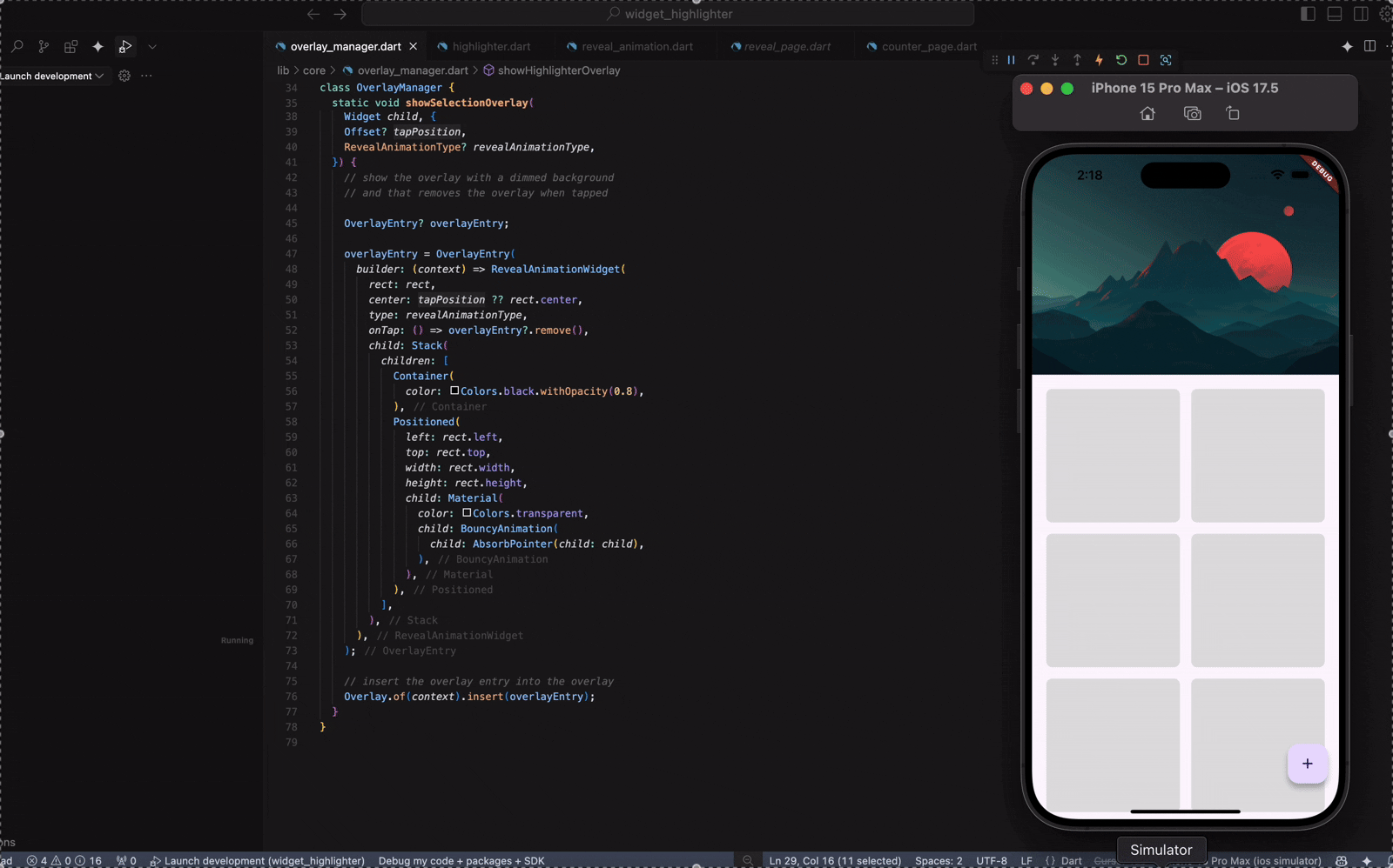
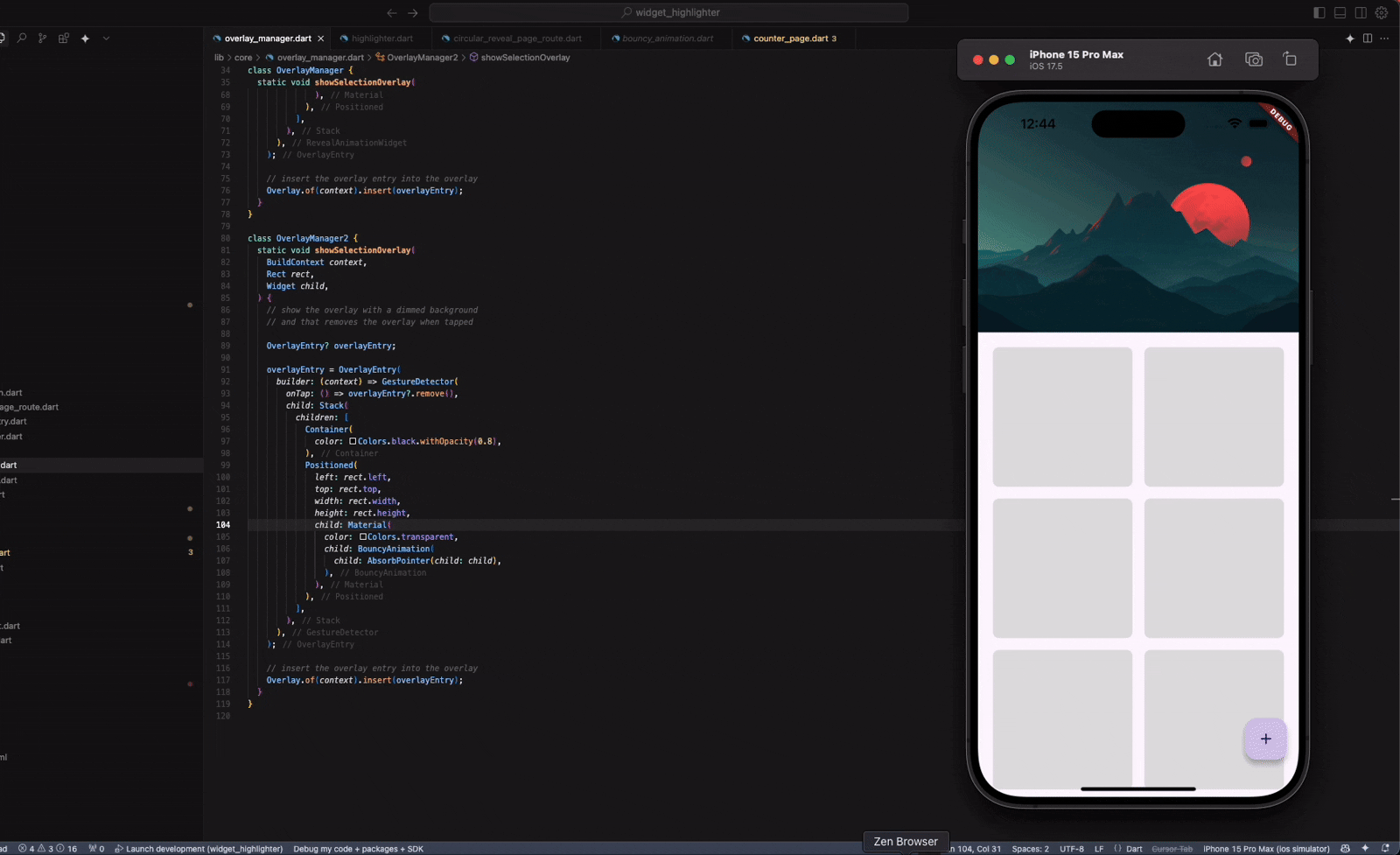
}And this is how it looks right now.
We achieved showing an overlay on long-pressing any widget on the screen.
Adding a bounce animation
So now that we have our overlay logic in place, we can start with the animations. And the first one we tackle is the bounce animation.
If you need a primer on animations, here is where you go.
So, from the title, you saw that when the overlay appears, the widget bounces a little. And this time, we are going to get into another new topic, which is TweenSequence.
// bouncy animation widget
// this widget should take in a hild and animate it like a bouncy ball
import 'package:flutter/widgets.dart';

class BouncyAnimation extends StatefulWidget {
  const BouncyAnimation({
    required this.child,
    super.key,
    this.duration = const Duration(milliseconds: 700),
    this.scale = 1.2,
  });

  final Widget child;
  final Duration duration;
  final double scale;

  @override
  _BouncyAnimationState createState() => _BouncyAnimationState();
}

class _BouncyAnimationState extends State<BouncyAnimation>
    with SingleTickerProviderStateMixin {
  late AnimationController _controller;
  late Animation<double> _scaleAnimation;

  @override
  void initState() {
    super.initState();
    _controller = AnimationController(
      vsync: this,
      duration: widget.duration,
    );

    _scaleAnimation = TweenSequence<double>([
      TweenSequenceItem(
        tween: Tween<double>(begin: 1, end: widget.scale)
          .chain(CurveTween(curve: Curves.easeOut)),
        weight: 15,
      ),
      TweenSequenceItem(
        tween: Tween<double>(begin: widget.scale, end: 0.95)
          .chain(CurveTween(curve: Curves.easeIn)),
        weight: 15,
      ),
      TweenSequenceItem(
        tween: Tween<double>(begin: 0.95, end: 1.02)
          .chain(CurveTween(curve: Curves.easeOut)),
        weight: 15,
      ),
      TweenSequenceItem(
        tween: Tween<double>(begin: 1.02, end: 0.98)
          .chain(CurveTween(curve: Curves.easeIn)),
        weight: 15,
      ),
      TweenSequenceItem(
        tween: Tween<double>(begin: 0.98, end: 1)
          .chain(CurveTween(curve: Curves.easeOut)),
        weight: 40,
      ),
    ]).animate(
      _controller
    );

    _controller.forward();
  }

  @override
  void dispose() {
    _controller.dispose();
    super.dispose();
  }

  @override
  Widget build(BuildContext context) {
    return ScaleTransition(
      scale: _scaleAnimation,
      child: widget.child,
    );
  }
}- The BouncyAnimation widget provides a dynamic entrance animation that temporarily scales its child widget to create a bounce effect. It does this using an animated scale transition driven by a time-based animation controller.
- This is implemented as a stateful widget, using SingleTickerProviderStateMixin to provide the necessary vsync for the animation controller. The AnimationController is initialised with a customizable duration, which determines the total time the animation will play.
- To control the scale transformation over time, the widget uses a TweenSequence. This allows for multiple tweens to be chained together with different easing curves and weights, resulting in non-linear and natural-feeling movement. The TweenSequence maps the animation controller’s value (which moves from 0.0 to 1.0 over the duration) to a changing scale factor for the child widget. The interpolation includes both ease-in and ease-out curves to simulate acceleration and deceleration as you’d expect from a physical bounce.
- The animation is triggered immediately in initState() by calling forward() on the controller. This ensures the bounce runs once as soon as the widget is inserted into the tree.
- In the build method, the child widget is wrapped with a ScaleTransition, which listens to the scale animation. As the animation progresses, ScaleTransition automatically applies the scale transformation to the child widget, rendering it larger or smaller frame-by-frame based on the current interpolated scale value.
- Finally, dispose() is overridden to clean up the controller when the widget is removed from the tree, preventing resource leaks.
I want to explain it all to you in one go, so bear with me if you already know this stuff. You can skip ahead.
Now you can just update the OverlayManager to show the Bounce Animation that we just created.
class OverlayManager {
  static void showSelectionOverlay(
    BuildContext context,
    Rect rect,
    Widget child,) {
    // show the overlay with a dimmed background
    // and that removes the overlay when tapped

    OverlayEntry? overlayEntry;

    overlayEntry = OverlayEntry(
      builder: (context) => GestureDetector(
        onTap: () => overlayEntry?.remove(),
        child: Stack(
          children: [
            Container(
              color: Colors.black.withOpacity(0.8),
            ),
            Positioned(
              left: rect.left,
              top: rect.top,
              width: rect.width,
              height: rect.height,
              child: Material(
                color: Colors.transparent,
                child: AbsorbPointer(child: child),
              ),
            ),
          ],
        ),
      ),
    );

    // insert the overlay entry into the overlay
    Overlay.of(context).insert(overlayEntry);
  }
}
Adding a circular reveal animation
Here’s another trick we are going to play.

We need the dimmed background when we show the overlay. But we need it to have a circular reveal animation. That means we want it to show up, but in a different fashion.
So we know the dimmed background will always be there, we just need to show it to the user in a circular reveal fashion. And for that we can use a clipper.
A primer on clip path, if you will.
What the clipper is doing
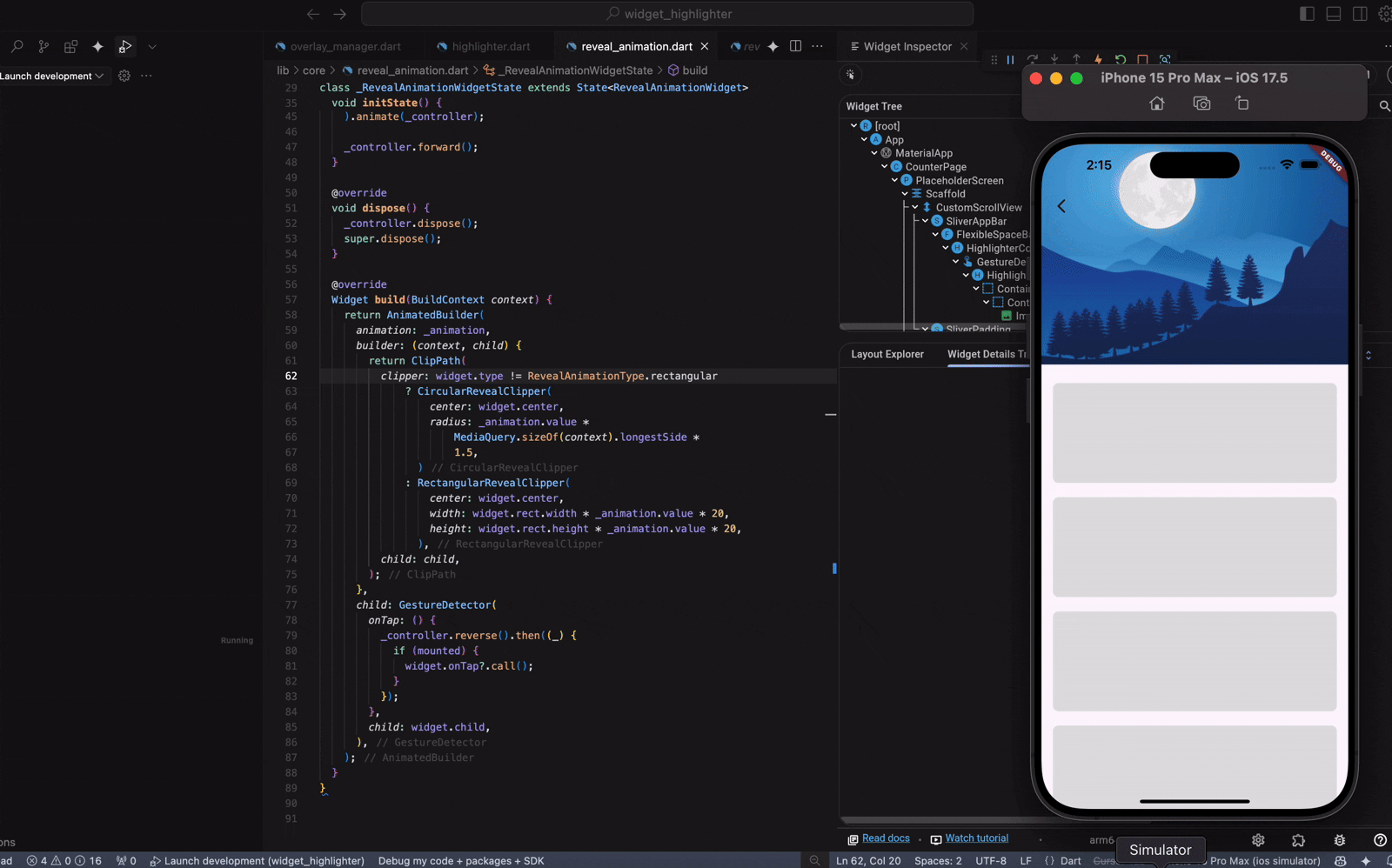
The CircularRevealClipper is used inside a ClipPath to dynamically mask the child widget (in this case, the dimmed background) with a circular shape that grows over time.
Is the dimmed background always on screen?
Yes — the dimmed background container is fully built and ready to be shown immediately. But:
- You don’t see it right away.
- It’s wrapped inside a ClipPath, which only reveals a circular portion of it.
- That circular portion starts small (radius = 0) and expands as the animation progresses.
So technically, the dimmed background is always there — it just starts completely clipped (invisible), and the animation “uncovers” it in a circular fashion.
Here is the code:
import 'package:flutter/material.dart';
import 'package:widget_highlighter/core/reveal_clipper.dart';

class RevealAnimationWidget extends StatefulWidget {
  const RevealAnimationWidget({
    required this.center,
    required this.child,
    required this.rect,
    super.key,
    this.onTap,
  });

  final Offset center;
  final Rect rect;
  final Widget child;
  final VoidCallback? onTap;

  @override
  State<RevealAnimationWidget> createState() => _RevealAnimationWidgetState();
}

class _RevealAnimationWidgetState extends State<RevealAnimationWidget>
    with SingleTickerProviderStateMixin {
  late final AnimationController _controller;
  late final Animation<double> _animation;

  @override
  void initState() {
    super.initState();
    _controller = AnimationController(
      duration: const Duration(milliseconds: 300),
      vsync: this,
    );

    _animation = Tween<double>(
      begin: 0,
      end: 1,
    ).animate(_controller);

    _controller.forward();
  }

  @override
  void dispose() {
    _controller.dispose();
    super.dispose();
  }

  @override
  Widget build(BuildContext context) {
    return AnimatedBuilder(
      animation: _animation,
      builder: (context, child) {
        return ClipPath(
          clipper: CircularRevealClipper(
            center: widget.center,
            radius:
                _animation.value * MediaQuery.sizeOf(context).longestSide * 1.5,
          ),
          child: child,
        );
      },
      child: GestureDetector(
        onTap: () {
          _controller.reverse().then((_) {
            if (mounted) {
              widget.onTap?.call();
            }
          });
        },
        child: widget.child,
      ),
    );
  }
}
This widget reveals its child using a circular animation that expands outward from a given centre point, typically where the user interacted.
What you pass into it
- center: This is the starting point of the reveal. If the user taps somewhere, that’s the point where the animation should begin expanding.
- rect: This gives the widget’s position and size on the screen. It’s mostly for context and layout purposes.
- child: The actual widget you want to reveal — this might be an overlay with a dimmed background and a highlighted UI element.
- onTap: A function that runs when the user taps on the overlay, usually to dismiss it.
How the animation works
The reveal uses an AnimationController that runs from 0 to 1 in 300 milliseconds. That value controls how big the circle is as it expands. The radius starts at 0 and grows until it fully covers the screen. To make sure it always reaches the edges, it multiplies the progress by the longest side of the screen and scales it up a bit more.
As the animation runs, it uses AnimatedBuilder to rebuild the UI continuously with a growing circular clip. The actual clipping is done using ClipPath and a custom clipper that draws a circle centred at the tap point with the current radius.
What happens when you tap
When the overlay is tapped, the animation runs in reverse, shrinking the circle back down. Once that finishes, it calls the onTap callback so you can clean up, for example, removing the overlay. It also makes sure to dispose of the animation controller when the widget is done to free up memory.
We also need to build our CircularRevealClipper which does the clipping.
class CircularRevealClipper extends CustomClipper<Path> {

  CircularRevealClipper({
    required this.center,
    required this.radius,
  });

  final Offset center;
  final double radius;

  @override
  Path getClip(Size size) {
    return Path()
      ..addOval(
        Rect.fromCircle(
          center: center,
          radius: radius,
        ),
      );
  }

  @override
  bool shouldReclip(CustomClipper<Path> oldClipper) {
    return true;
  }
}
What this class is for
This is a custom clipper that defines a circular clipping path — it tells Flutter which part of a widget should be visible. Everything outside the defined path gets clipped (i.e., not shown on screen).
getClip(Size size)
This method defines the actual clipping shape. It’s called every time the widget needs to be painted or repainted.
Inside getClip, it builds a Path:
- It adds a circular shape using addOval(…) with a Rect.fromCircle(…).
- That Rect is defined by the current centre and radius.
So, if the radius is small, the visible area is a tiny circle. As the radius grows, the visible area expands outward from the centre.
This is what makes the reveal animation possible.
Now you can just update your OverlayManager again to include the newly built RevealAnimationWidget.
class OverlayManager {
  static void showSelectionOverlay(
    BuildContext context,
    Rect rect,
    Widget child, {
  }) {
    // show the overlay with a dimmed background
    // and that removes the overlay when tapped

    OverlayEntry? overlayEntry;

    overlayEntry = OverlayEntry(
      builder: (context) => RevealAnimationWidget(
        rect: rect,
        center: rect.center,
        onTap: () => overlayEntry?.remove(),
        child: Stack(
          children: [
            Container(
              color: Colors.black.withOpacity(0.8),
            ),
            Positioned(
              left: rect.left,
              top: rect.top,
              width: rect.width,
              height: rect.height,
              child: Material(
                color: Colors.transparent,
                child: BouncyAnimation(
                  child: AbsorbPointer(child: child),
                ),
              ),
            ),
          ],
        ),
      ),
    );

    // insert the overlay entry into the overlay
    Overlay.of(context).insert(overlayEntry);
  }
}
Now that we have the animation, why not add it to the page transition?
So now that we have our clipping logic in place, and we understand how the clipping actually works, you can very well guess that if we move from one page to the other, and if we wanted it to have a reveal transition, we could just use the same clipper to animate.
class CircularRevealPageRoute<T> extends PageRouteBuilder<T> {
  CircularRevealPageRoute({
    required this.page, // The page (screen) to show
    required this.centerAlignment, // Where the circular reveal should start from (Offset)
    super.settings,
  }) : super(
    // Builds the actual content of the route
    pageBuilder: (context, animation, secondaryAnimation) => page,

    // Duration of the forward animation when pushing the page
    transitionDuration: const Duration(milliseconds: 300),

    // Duration of the reverse animation when popping the page
    reverseTransitionDuration: const Duration(milliseconds: 300),

    // This builds the transition animation
    transitionsBuilder: (context, animation, secondaryAnimation, child) {
      return AnimatedBuilder(
        animation: animation, // Listens to the animation progress (0.0 to 1.0)
        builder: (context, child) {
          return ClipPath(
            // Clip the child using a growing circular path
            clipper: CircularRevealClipper(
              center: centerAlignment, // The center of the reveal animation
              radius: Tween<double>(
                begin: 0,
                // Grows large enough to cover entire screen (scaled up for safety)
                end: MediaQuery.of(context).size.longestSide * 1.5,
              ).evaluate(animation), // Calculate the current radius based on animation progress
            ),
            child: child, // The page content to reveal
          );
        },
        child: child,
      );
    },
  );

  final Widget page; // The destination page widget
  final Offset centerAlignment; // The point from which the circle should expand
}
Now you could simply call the Navigator to push a new page.
Navigator.of(context).push(
CircularRevealPageRoute<void>(
page: const RevealPage(),
centerAlignment: _findCenter(id),
),
);
Offset _findCenter(String id) {
final key = GlobalKeyRegistry.instance.getKey(id);
final context = key.currentContext;
if (context == null) return Offset.zero;
final renderBox = context.findRenderObject() as RenderBox?;
if (renderBox == null) return Offset.zero;
final offset = renderBox.localToGlobal(Offset.zero);
final size = renderBox.size;
final center = Offset(
offset.dx + size.width / 2,
offset.dy + size.height / 2,
);
return center;
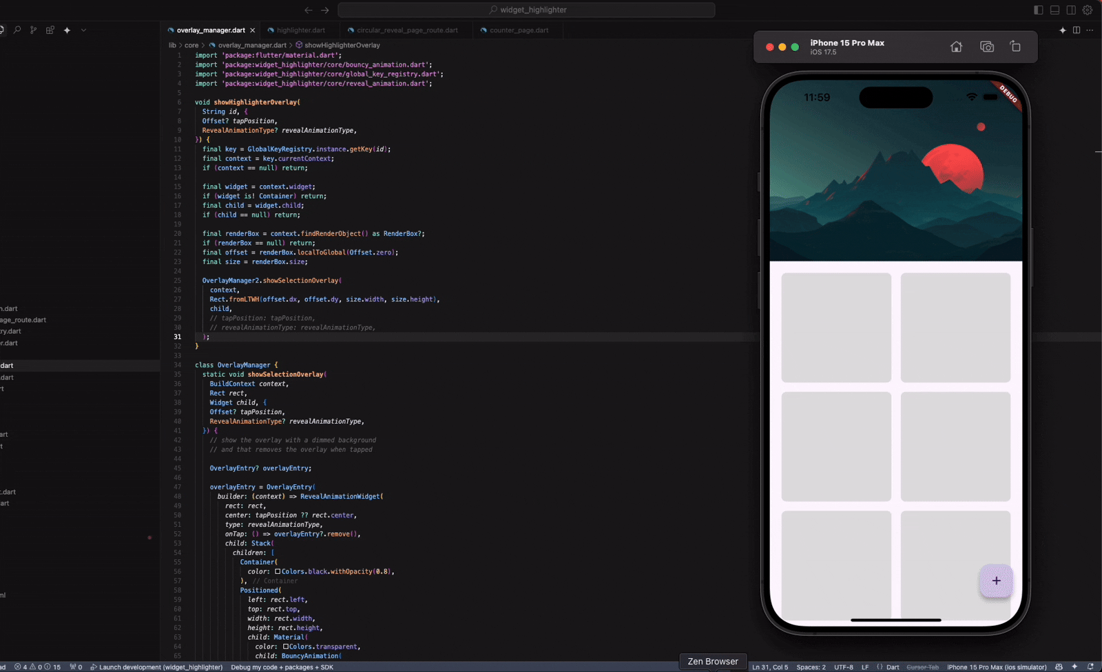
}And voila!
Can we modify our circular animation to adjust for other design elements?
Can you see that with different shape, we might want to adjust our animation. We squares or rectangle, we might want our background to be revealed in a different way. And you know what we might need to change for that?
Yes, the clipper!
We can just build a new clipper that clips a rectangle rather than a circle, and just animate it the same way.
Here is the clipper:
class RectangularRevealClipper extends CustomClipper<Path> {
  /// Creates a rectangular reveal clipper.
  ///
  /// The [center] is the starting point of the rectangle.
  /// [width] and [height] are the initial dimensions of the rectangle.
  /// [radius] is the radius of the rounded corners.
  /// If [expanding] is true, the rectangle expands to fill the screen, otherwise, it shrinks.
  RectangularRevealClipper({
    required this.center,
    required this.width,
    required this.height,
    this.radius = 0.0,
    this.expanding = true,
  });

  final Offset center;
  final double width;
  final double height;
  final double radius; // Added for rounded corners
  final bool expanding;

  @override
  Path getClip(Size size) {
    // Calculate the maximum width and height to fill the screen.
    final maxWidth = size.width;
    final maxHeight = size.height;

    // Determine the current width and height based on whether we are expanding or shrinking.
    final currentWidth = expanding ? width : maxWidth - width;
    final currentHeight = expanding ? height : maxHeight - height;

    // Calculate the top-left corner of the rectangle.
    var left = expanding
        ? center.dx - width / 2
        : center.dx - (maxWidth - width) / 2;
    var top = expanding
        ? center.dy - height / 2
        : center.dy - (maxHeight - height) / 2;

    // Ensure that the left and top values are within the bounds of the screen.
     left = left.clamp(0, size.width);
     top = top.clamp(0, size.height);


    // Create the rectangle.
    final rect = Rect.fromLTWH(left, top, currentWidth, currentHeight);


    return Path()
      ..addRRect(
        RRect.fromRectAndRadius(
          rect,
          Radius.circular(radius), // Use the provided radius
        ),
      );
  }

  @override
  bool shouldReclip(CustomClipper<Path> oldClipper) {
    if (oldClipper is RectangularRevealClipper) {
      return center != oldClipper.center ||
          width != oldClipper.width ||
          height != oldClipper.height ||
          radius != oldClipper.radius ||
          expanding != oldClipper.expanding;
    }
    return true;
  }
}
So the purpose is to create a rectangular-shaped mask (or clip) that can grow or shrink from a center point on the screen.
Let’s break this down:
Constructor Parameters
- center: The central point from which the rectangle originates or collapses.
- width and height: The base dimensions of the rectangle. These are used differently based on whether the animation is expanding or shrinking.
- radius: Optional. Adds rounded corners to the rectangle.
- expanding: A flag that determines whether the rectangle grows outward (true) or shrinks inward (false).
getClip(Size size)
This is the method that defines what portion of the widget should be visible.
- Find the max dimensions of the screen using the size passed into the method.
- Calculate current width/height: If expanding, use the given width and height. If shrinking, subtract those from the screen’s full width/height to simulate the rectangle getting smaller.
- Figure out the top-left corner of the rectangle so it stays centred at the centre point. Again, the logic changes slightly depending on expanding vs. shrinking.
- Clamp left and top values to make sure the rectangle doesn’t go off-screen.
- Build the rectangle using Rect.fromLTWH() and wrap it with RRect.fromRectAndRadius() if you want rounded corners.
- Return the path, so that only this shape will be visible on screen.
shouldReclip
This tells Flutter whether to recalculate the clip.
- It compares all the key properties (centre, width, height, radius, expanding) to the old clipper.
- If anything changed, it returns true to trigger a reclip.
- Otherwise, it keeps the existing path for performance.
So we have everything ready, we just need to update our RevealAnimationWidget to accommodate a new kind of clipper which you can differentiate using a flag.
@override
  Widget build(BuildContext context) {
    return AnimatedBuilder(
      animation: _animation,
      builder: (context, child) {
        return ClipPath(
          clipper: widget.type != RevealAnimationType.rectangular
              ? CircularRevealClipper(
                  center: widget.center,
                  radius: _animation.value *
                      MediaQuery.sizeOf(context).longestSide *
                      1.5,
                )
              /// New clipper
              : RectangularRevealClipper(
                  center: widget.center,
                  width: widget.rect.width * _animation.value * 20, // random value
                  height: widget.rect.height * _animation.value * 20,
                ),
          child: child,
        );
      },
      child: GestureDetector(
        onTap: () {
          _controller.reverse().then((_) {
            if (mounted) {
              widget.onTap?.call();
            }
          });
        },
        child: widget.child,
      ),
    );
  }
Phew. You made it. You read the whole thing. That’s wild.
Thanks for sticking around — either you’re super curious or accidentally left your screen on while making coffee. Either way, I appreciate you.
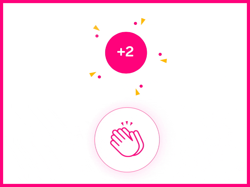
Now, if this post helped, entertained, or mildly improved your day, feel free to smash that clap button. Medium lets you clap up to 50 times, which is… a weirdly high number. But hey, go wild. Pretend you’re giving a round of applause with both hands, twice.
No pressure, of course. But also… pressure.
Thanks again. You’re the best.